CMU alum leaves mark on college town
As people enter Mount Pleasant from the west side of the state, they'll be greeted with a maroon and gold bridge reading "Welcome to Mount Pleasant," all thanks to the creative mind of one Central Michigan University alum.
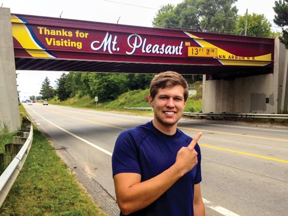
Clay McAndrews, who graduated from CMU in 2013 and majored in Graphic Design, is the mastermind behind the freshly-painted design intended to transform the old railroad viaduct over High Street.
Keith and Kurt Feight, father and son, started the project in 2011 to make over the bridge into a sign welcoming visitors to the community. McAndrews got involved with the project after hearing about the idea from his fraternity housing advisor.
“I heard about the project from my fraternity housing advisor who is a local Mount Pleasant native," McAndrews said. "(He) felt I would be interested in the project because of my involvement in graphic design."
The father/son duo felt the bridge could be used as a way to represent Mount Pleasant and decided they wanted to do something about it. They worked to raise money privately through the Mount Pleasant Community Foundation to pay for the project.
According to mpafc.org, the estimated cost of the bridge was $100,000.
McAndrews said he wanted his design to incorporate many different aspects of life in Mount Pleasant. He also wanted to represent CMU and and its relationship with the town.
“I wanted to focus on bringing in CMU colors to the design, as well as the colors of Mount Pleasant and of Mount Pleasant High School. I wanted a clean and timeless design, and I think that’s what we ended up with,” he said.
During the process of creating his design, McAndrews said it was complicated, but worth the effort.
“Very rarely is there a design that comes together easily,” he said. “It took a lot of time and we went through over ten versions of the design before we found one that worked.”
McAndrews said early on in the redesign process he took photos of the bridge and worked in Photoshop to create initial plans for how he wanted the sign to look. He then worked with an engineer to plan his design around the existing dimensions and measurements of the bridge.
The design has a maroon base with a blue, white and gold ribbon running through it. In white lettering, it reads, “Welcome to Mt. Pleasant,” for people driving into the city from the west. On the opposite side, the sign reads, “Thanks for visiting Mt. Pleasant,” also in white lettering.
Majik Graphics Inc. of Clinton Township put up the sign itself. The design, which McAndrews describes as being made out of a high performance sticker, stands against a maroon background and is completely graffiti resistant.
McAndrews said any potential graffiti to the sign could just be wiped right off, because of the graffiti resistant finish.


